The goal of this module is to help us decide what type of graph(s) we should use to present our data. There are a few specific things we should think about when creating a graph. First, what is the purpose of our graph? Graphs are helpful in all three phases of data analysis: exploration, summarization, and communication. When we first explore our data, graphs can help us find unusual data points, trends, or relationships. When we summarize our findings, graphs can effectively present our data in a concise way and in a meaningful format. Finally, when we communicate our results, graphs provide a powerful tool for telling the story of our research.
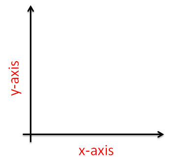
Graphs are usually two-dimensional (“flat”) pictures of our data. Two dimensions give us two scales with which to work. Typically we assign our variable of interest (the dependent or response variable) to the vertical (y) axis and our experiment variable (independent or explanatory variable) to the horizontal (x) axis (Fig. 1)
Figure 1. Example of x-axis and y-axis layout.
TIPS:
Stay away from “3D”“ graphs. They are hard to read and your information can easily be misinterpreted. We know they look cool, but don’t use them. 🙂
The type of graph we will use is often best determined by the type of data we collect. Refer to the Classifying Data Module for more information on the most common types of data.
Graphing COUNT Type Data
Let’s start with count data. Counts are most easily and accurately displayed using bar graphs (these are called column charts in Excel). Bars allow us to compare counts across different categories.
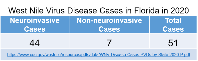
For example, let’s say we are looking at the incidence of reported West Nile virus human cases in the state of Florida during 2020.[1] The data are shown in Table 1.
Table 1. CDC-reported West Nile virus disease cases in Florida in 2020.
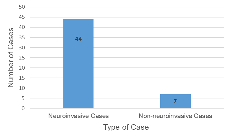
Now let’s create a bar graph (chart) with two bars (one for each type of disease case above). Since we are most interested in the number of cases, this will be the choice for the y-axis. The type of case will be on the x-axis.
This bar graph (Fig. 2) displays our data simply and effectively, and it allows us to make a comparison (neuroinvasive vs. non-neuroinvasive cases) using simple visual geometry (the sizes of the rectangles). Using the graph, we can see that there were many more neuroinvasive cases than non-neuroinvasive cases, which means that patients with West Nile virus were more likely to present neuroinvasive symptoms (e.g. encephalitis) than no neuroinvasive symptoms.
Figure 2. Number of neuroinvasive and non-neuroinvasive West Nile virus disease cases in Florida in 2020.
The vertical scale for bar graphs should always start at 0 in order to avoid misleading comparisons.
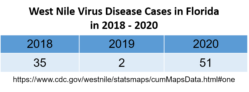
Table 2. CDC-reported West Nile virus cases in Florida from 2018-2020.
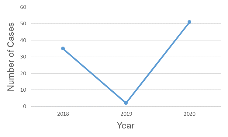
In our next example, suppose that instead of just looking at 2020 data, we want to examine the number of cases of West Nile virus in humans in Florida over a three-year period (2018-2020)[2].
When graphing these data, we should keep in mind which detail of the data we are most interested in communicating. In the previous example (Fig. 2), we were comparing two non-ordered categories (neuroinvasive vs. non-neuroinvasive). In this example, we are looking at how the data change over time; that is, we are looking for a trend. In this case, a line graph is a good choice (Fig. 3).
Figure 3. Number of West Nile virus cases in Florida from 2018-2020.
With line graphs, the focus is on the relationship between the points, not the counts themselves (although these can still be on the graph). The lines draw our eyes across time (from left to right) and emphasize whether the West Nile cases are decreasing (the line with the downward slope) or increasing (the line with the upward slope).
In this example, the number of West Nile cases decreased from 2018 to 2019 and then increased from 2019 to 2020. We can then use this information to consider other variables we might relate to West Nile. For example, 2019 may have been a drier year resulting in fewer mosquitos. Or, perhaps in 2020 more people spent time outdoors due to the COVID-19 pandemic, increasing the number of people who could potentially become infected from a carrier mosquito[3].
Graphing CONTINUOUS Type Data
Continuous data can also be displayed using bar graphs where we divide our continuous variable into intervals (bins) and count the number of data points within each segment. This specific type of bar graph is called a histogram.
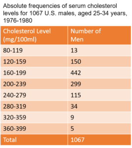
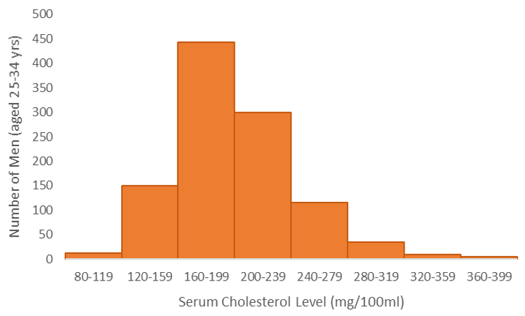
Histograms depict the frequency distribution for continuous data. Let’s consider some historical data[4] on total serum cholesterol levels recorded in a sample of U.S. men as displayed in Table 3.
Table 3. Cholesterol levels of young men in the U.S. between 1976-1980.
The data can be displayed using a histogram (Fig. 4). Each bar represents the number of men with total cholesterol levels in the designated range (these are called bins in Excel). The range of values used for each bin are typically set by the researcher.
The histogram allows us to assess the number of men in the healthy range (less than 200mg/100ml) as well as the number of men in the high risk range (greater than 240mg/100ml).
When making a histogram, all of the intervals should be evenly spaced so that the graph is not misleading.
Figure 4. Total serum cholesterol levels in young U.S. men from 1976-1980.
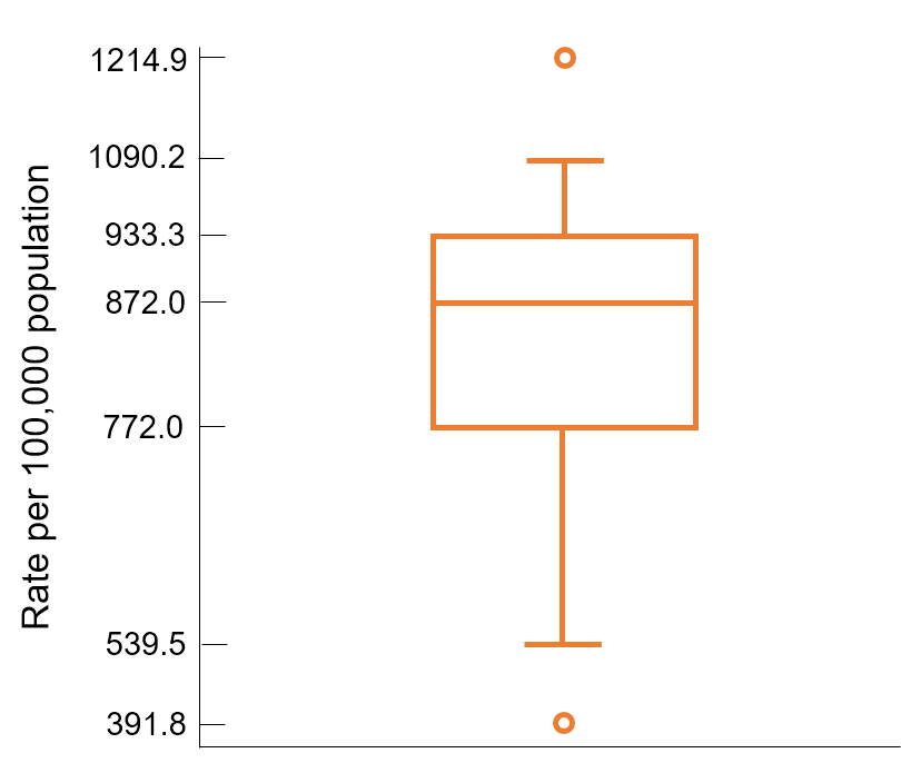
Figure 5. 1992 U.S. death rates by state and D.C.
For more about percentiles, see the Ratios And Proportions Module.
Another type of graph that represents continuous data is a box plot, or box and whiskers plot (Fig. 5). Box plots convey information about a relative distribution of the variable of interest. The example in Fig. 5 shows the 1992 death rates for all 50 states and the District of Columbia[4].
The box extends from the 25th percentile (772.0 per 100,000) to the 75th percentile (933.3 per 100,000). The 25th and 75th percentiles of a data set are called quartiles. The line running between the quartiles (872.0 deaths per 100,000) marks the 50th percentile (median) of the data set. Half the observations are less than or equal to 872.0 per 100,000, and the other half is greater than or equal to this value.
The lines projecting out from the box on either side (whiskers) extend to the adjacent values of the plot. Adjacent values are the most extreme observations in the data set that are more than 1.5 times the height of the box beyond either quartile. In fairly symmetric data sets, the adjacent values should contain approximately 99{9908f2c9ebc0a4299df98c4fc5aecffecd9da31aa7e644f64ccda5ab2923917a} of the measurements. All points outside the whisker range are represented by circles; these observations are potential outliers and are unusual when compared with the rest of the values. In this example, Alaska has an unusually low death rate (391.8 per 100,000 people) and Washington D.C. has an unusually high death rate (1214.9 per 100,000 people).
Graphing PERCENTAGE Data
Percentages are all about proportions: the relationship of the measurement to the whole, a part, etc. Naturally, we would expect a graph of such data to strive to represent the proportionality of the data. There are two different ways to represent percentage data most effectively: segmented bar graphs and stacked line graphs.
Segmented bar graphs compare categorical data across two groups that represent the proportion or percentage of times that each outcome occurs in each group. Using percentages is much more informative than only indicating the number of occurrences, especially if the groups have different sample sizes. To demonstrate the power of segmented bar graphs, consider the following scenario. Workers in factories across the U.S. frequently report work-related illnesses to their respective state Department of Health. In May of 2000, a physician reported eight cases of fixed obstructive lung disease in workers from a microwave-popcorn production plant in Missouri to the Missouri Department of Health[5]. The workers became ill during their 8-month to 9-year employment at the plant. Researchers wanted to understand why there were so many cases of obstructive lung disease at this specific plant.
The first step taken by the research team was to determine the level of diacetyl, a butter-flavor ketone, and other volatile organic compounds (VOCs) that the workers were exposed to in various areas of the plant. Diacetyl served as a marker of exposure to many VOCs detected in the plant. The researchers then evaluated medical examinations and environmental surveys of workers currently employed at the plant in areas of high diacetyl and low diacetyl. Part of the medical examination was spirometric testing, which measures the volume of air a person is able to forcefully exhale. Example data taken from Chance and Rossman, 2005.[6]
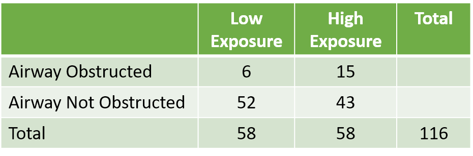
Table 4. Number of workers exposed to high and low levels of diacetyl and their spirometry testing results.
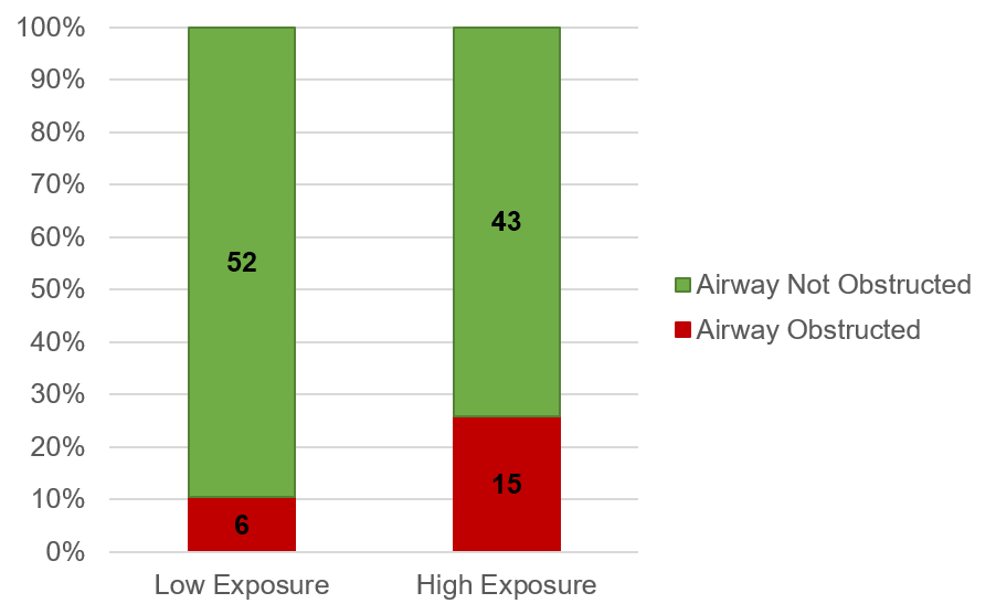
Now let us look at these results using a segmented bar graph (Fig. 6). Also known as a stacked column chart in Excel, this type of bar graph does a good job of displaying the association between the level of VOC exposure and development of airway obstruction. The high-exposure group displayed an almost 2.5-fold increased risk of developing an airway obstruction. This is very troubling for the plant and no regulatory limits existed for diacetyl. The CDC recommended adding engineering controls such as increased ventilation and isolating VOCs generated at the plant.
Figure 6. Cases of obstructed airway among workers in high VOC and low VOC areas of the microwave popcorn plant.
TIP:
In the case shown in Fig. 6, the low exposure and high exposure groups had the same number of workers in each sample (58). If the groups would have had different sample numbers, we would want to first convert our data to percentages and then plot the percentages on a stacked column chart.
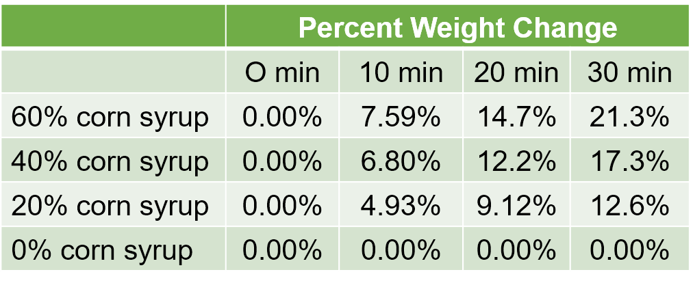
Table 5. Percent weight gain within dialysis tubing containing 0{9908f2c9ebc0a4299df98c4fc5aecffecd9da31aa7e644f64ccda5ab2923917a} to 60{9908f2c9ebc0a4299df98c4fc5aecffecd9da31aa7e644f64ccda5ab2923917a} corn syrup submerged in RO water for 0 to 30 minutes.
Consider the data in Table 5. In this experiment, dialysis tubing containing 0{9908f2c9ebc0a4299df98c4fc5aecffecd9da31aa7e644f64ccda5ab2923917a} to 60{9908f2c9ebc0a4299df98c4fc5aecffecd9da31aa7e644f64ccda5ab2923917a} corn syrup was placed in a large beaker of RO water. Because the dialysis tubing contains more solutes than RO, we expect the dialysis tubing to take on water over time. To evaluate this, the weight of the dialysis tubing was measured at the start of the experiment, and again after 10, 20, and 30 minutes of submersion in RO. The percent change in weight is shown in Table 5.
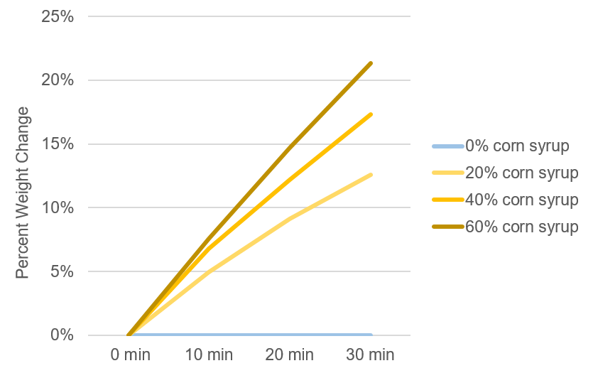
Figure 7. Percent change in weight of dialysis tubing containing corn syrup after submersion in RO water.
In addition to stacked bar graphs, line graphs are also useful for displaying percentage data. This type of graph works well when you want to look at trends in percentages, such as the percent weight gain over time during an osmosis experiment. Figure 7 shows the data from Table 5 using a line graph. By arranging the data in a line graph, we can see if there is a relationship between the percent weight gain due to osmosis and the beginning concentration of corn syrup. We can also visually compare the change in weights over time and across corn syrup concentrations. As we can see, higher concentrations of corn syrup tend to lead to larger increases in weight change over time.
Final Thoughts
We should always draw our graphs by hand before creating them using software such as Excel. This way we can make sure that our graphs look the way we want them to, and we won’t get stuck in the software’s defaults. This will motivate us to make the software do what we want it to do, not the other way around.
It is also a good idea to draw a graph of hypothetical data prior to conducting an experiment so that we understand our analysis plan for the type of data we plan to collect. This can help us know whether we need to make any changes to our experiment design or data collection plan.