References
1. Samuels ML, Witmer JA and Schaffner A (2011). Statistics for the Life Sciences, 4 edition. Addison Wesley. p. 480. ISBN 0321652800..
2. Dugopolski M (2002). Precalculus Functions and Graphs and Precalculus with Limits Functions and Graphs, 1st Edition; Instructor’s Edition edition. Pearson Education, Inc.; Addison Wesley. p. 160. ISBN 0201734613.
3. Dugopolski M (2002). Precalculus Functions and Graphs and Precalculus with Limits Functions and Graphs, 1st Edition; Instructor’s Edition edition. Pearson Education, Inc.; Addison Wesley. p. 160. ISBN 0201734613.
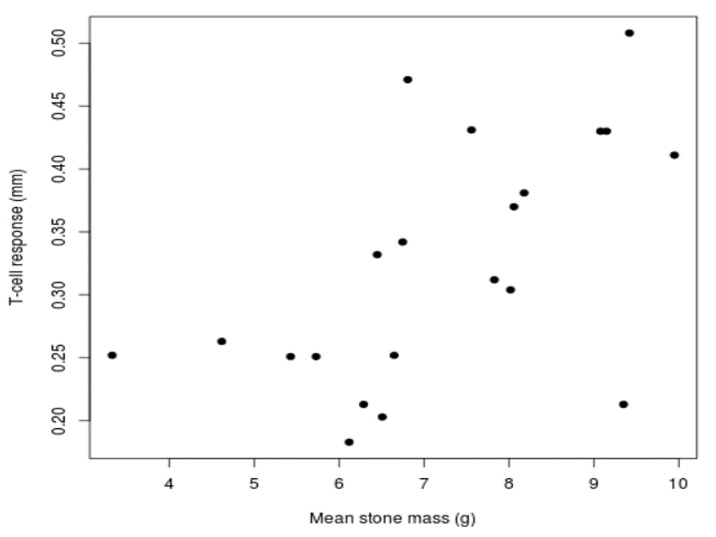
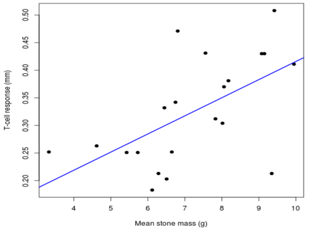
4. Soler M, Martín-Vivaldi M, Marín JM, Møller AP (1999). “Weight lifting and health status in the black wheatear.” Behavioral Ecology, 10(3), pp. 281 –286. https://academic.oup.com/beheco/article/10/3/281/201579.
5. Ramsey F and Schafer D (2002). The Statistical Sleuth: A Course in Methods of Data Analysis, 2 edition. Duxbury Press. p. 221. ISBN 0534386709.